No products in the cart.
Color Theory for Fair Isle by Claire Morson
On Your Way to the Masters Summer 2023
Glorious color! The world around us is full of visual inspiration, man-made and natural artwork. When we start adding multiple colors to our knitted projects, the possibilities are endless—but also very intimidating. There are so many colors to choose from. How do we know what colors will look good together? Will the design show up? What part of the design will be emphasized? Will the finished product look like the picture in my head?
Both Levels 2 and 3 require a Fair Isle project. The Level 2 wristlet can be worked using the colors listed in the pattern or colors chosen by the submitter. Using the color and grayscale photos included in the pattern as a guide, a submitter has a good chance of successfully choosing a pleasing color palette that will show the motifs well.
For Level 3, a Fair Isle hat or sweater is required, designed from scratch by the submitter. This is a more challenging exercise, requiring a great deal more planning and swatching. Understanding how colors interact with each other is an important first step in choosing an appropriate palette. We all have favorite colors, as well as colors that flatter our individual complexions. A pleasing and attractive color scheme can be created from any portion of the color wheel.
Basic Color Theory
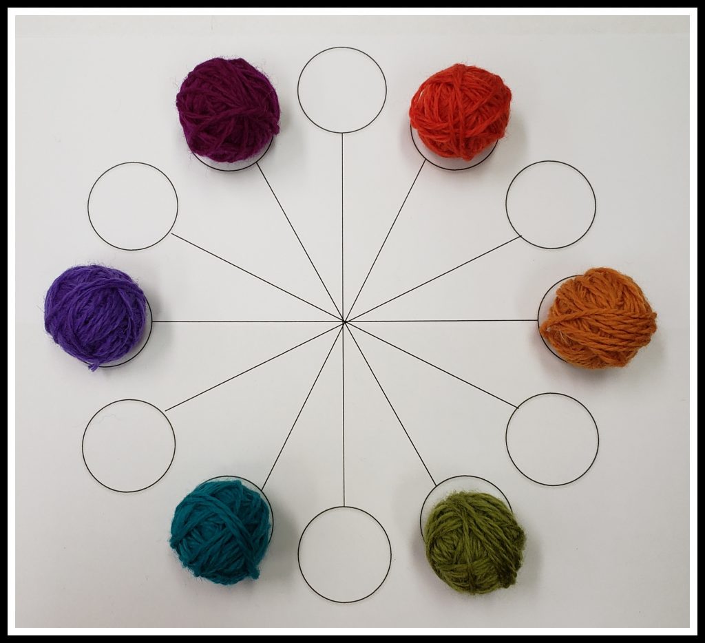
The famous physicist and mathematician, Sir Isaac Newton, developed the first color wheel in 1666. It was his experiments with prisms and light that led to his circular mapping of the various hues that are contained in clear white light. In the 1920s, Johannes Itten, a Swiss-born painter and teacher, developed the 12-part color wheel that we still use today. Here is my version:
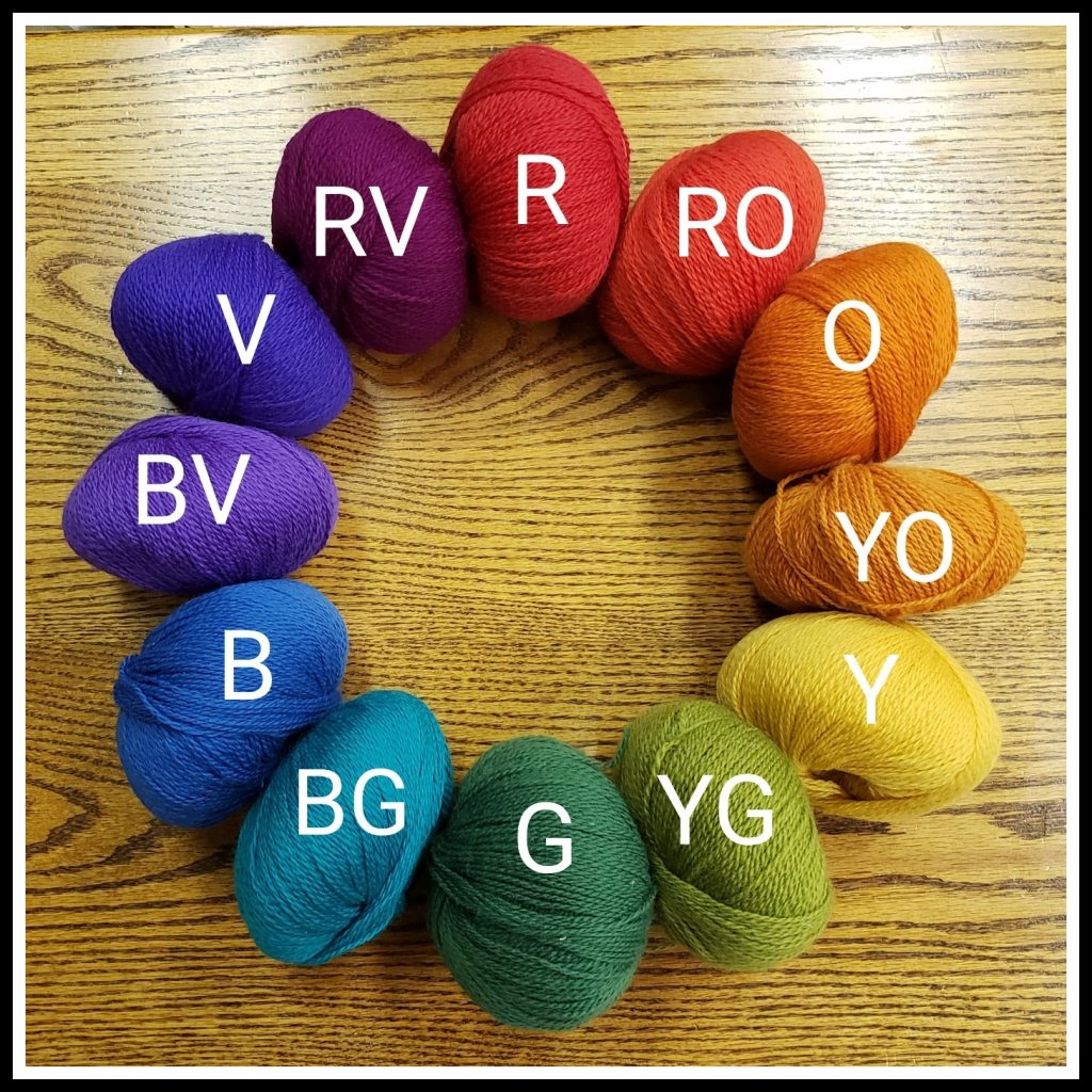
The color wheel is made up of:
- Primary Colors: red, yellow, and blue. These are the colors from which all other colors can be produced. These three colors cannot be mixed from other colors.
- Secondary Colors: orange, green, and violet. These colors are created by mixing the primary colors. Red and yellow combine to make orange, yellow and blue combine to make green, and blue and red combine to make violet.
- Tertiary Colors: red-orange, yellow-orange, yellow-green, blue-green, blue-violet, and red-violet. These colors are created by mixing a primary color with a secondary color.
Here is where they fall on the Color Wheel:
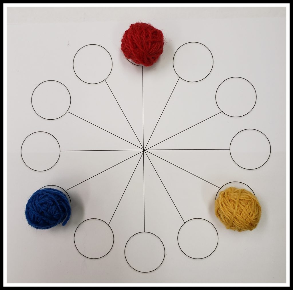
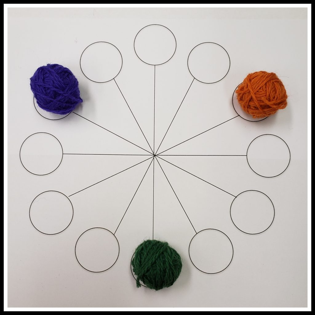
Itten also described combinations of colors that he called “color chords,” which are based on the relationship of the colors within the color wheel. We call them color harmonies. While there are endless combinations of colors, an established color harmony can be the base on which to build a pleasing color palette for a Fair Isle project.
Here are some of the basic color harmonies:
- Monochromatic. A monochromatic color palette combines several colors that are all variations of the same color on the color wheel; for example, baby blue, royal blue, and navy are all variations of blue.
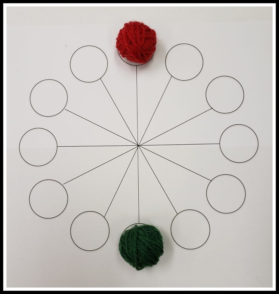
- Complementary Colors. Complementary colors are two colors that are directly opposite from each other on the color wheel. Some examples are red and green, blue and orange, and yellow and violet. Complementary color schemes look vibrant. When complementary colors are placed next to each other, there is the added benefit of enhancing the colors; for example, red looks redder when placed next to green. This is a characteristic that could be used to advantage when choosing colors for Fair Isle projects.
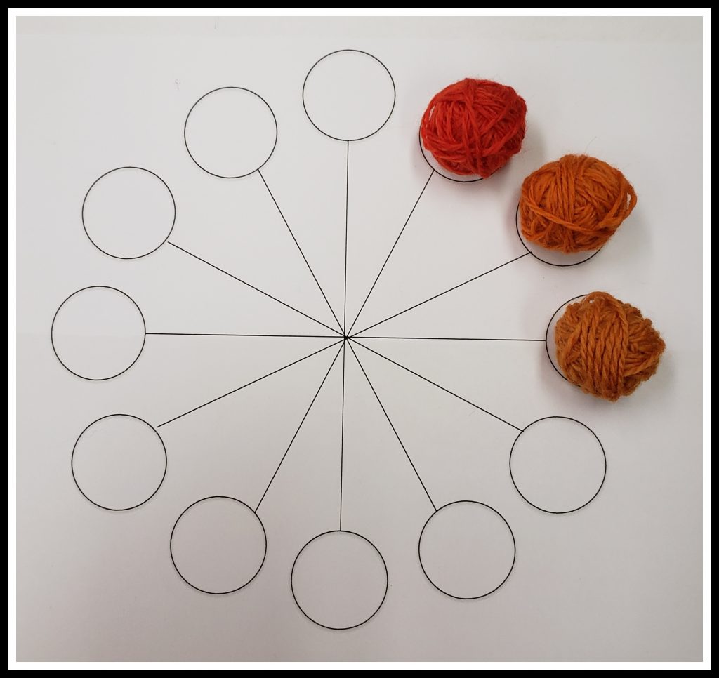
- Analogous Colors. Analogous colors are three colors that are next to each other on the color wheel. Analogous color schemes are soothing. An example is red-orange, orange, and yellow-orange. These combinations are similar to a monochromatic color scheme since the colors are near each other on the color wheel, but they are more interesting since more than one color is involved.
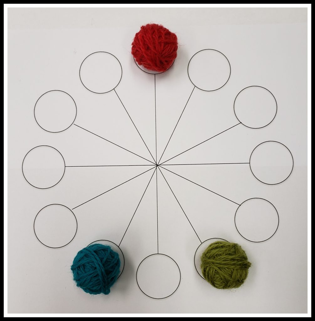
- Split Complementary Colors. A variation of the complementary color harmony, split complementary color schemes combine one color with the two colors on each side of its complement. An example is red, yellow-green, and blue-green.
Here are some illustrations of color harmonies:
There are other, more complex, multi-color combinations that have been defined by color theorists. Melissa Leapman describes several them in Mastering Color Knitting.
Contrast, Contrast, Contrast!
Without adequate contrast, the motifs in a colorwork design won’t show up. All the effort expended in knitting with multiple colors is wasted if the designs aren’t visible. The most important factor to consider when choosing colors that will adequately contrast to each other is the color’s value. Put simply, the definition of value is how light or dark a color is. This is usually obvious, like the simple contrast of white and blue in the photo below.
When two different colors are compared to each other, sometimes it is difficult to determine which is darker than the other. The easiest way to see the relative value of a group of colors is to take a grayscale photo. A grayscale photo is also helpful in arranging colors from light to dark, when a graduated color scheme is desired.
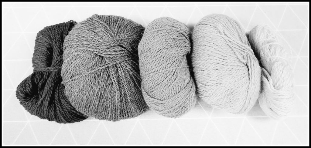
Below are photos of eight different greens and blue-greens, one in color and one in grayscale. Note that there is a range of values in this sample of colors, from light to medium to dark.
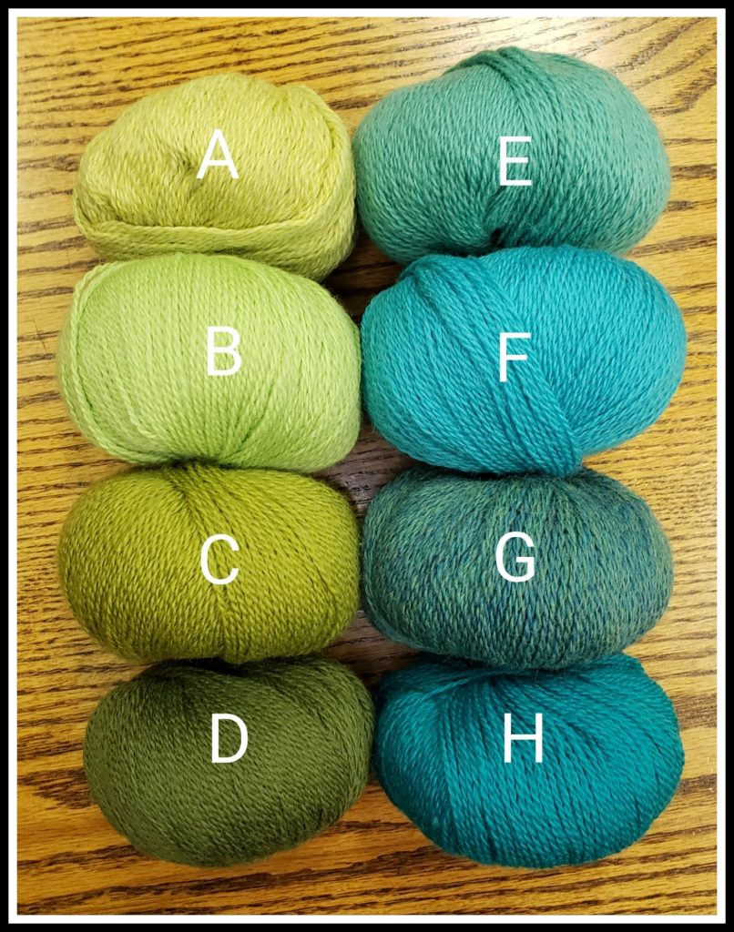
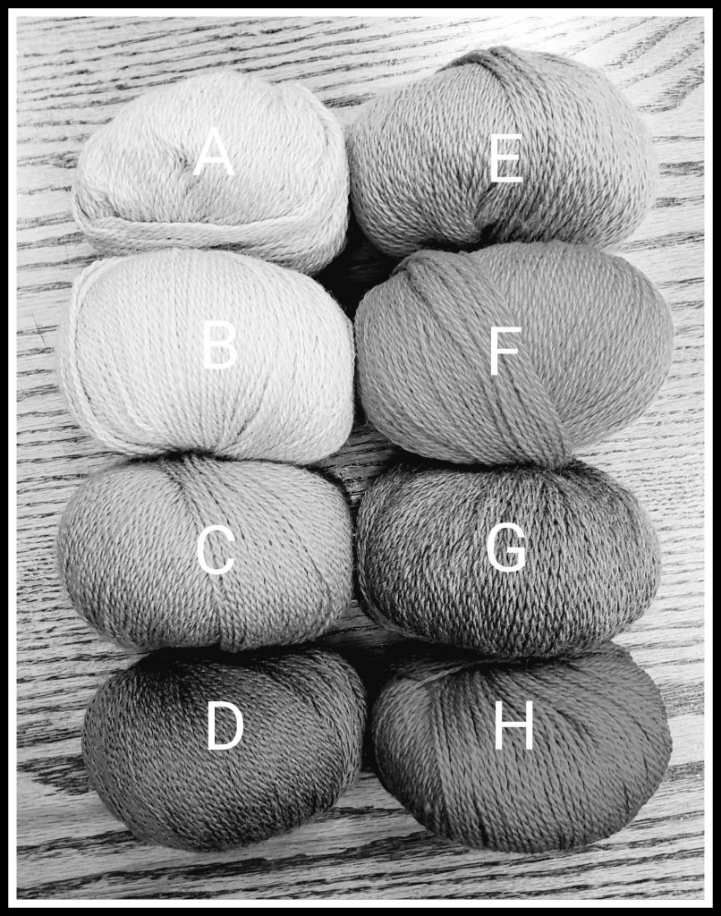
In the grayscale photo, it is obvious that colors A and B are the same value. If they were used next to each other in a colorwork design, they would look the same. In fact, those colors are so close that it probably wouldn’t add much interest to include both of them in the color palette. In the color photo, it is difficult to see which is darker, color C or color F, whereas the grayscale photo shows F to be darker than C. Color D seems darker than color H in the color photo, but in the grayscale photo, those colors are shown to be quite close in value. Color G is the only obviously heathered color in the sample. In the color photo, it appears rather dark, but the grayscale photo reveals the variety of values combined in the single yarn. This effect makes it more difficult to place this yarn correctly in a gradation of value. Or perhaps, it just adds flexibility, allowing the heathered yarn to be used in more than one place.
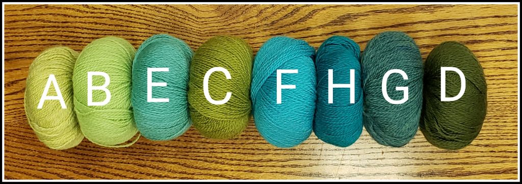
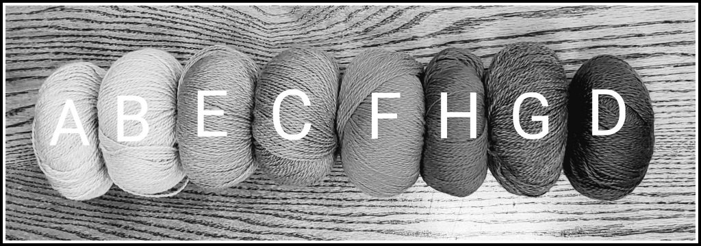
Below are photos of these same yarns, ordered from light to dark, using the grayscale photo as a guide.
Color Placement Within the Design
Traditional Fair Isle uses only two colors in each row/round. There is generally an identifiable background and an identifiable motif within the design. A simple color palette could use one color for the background and one color for the motif, such as in the two-color Contrast photo above. (Note that Level 3 projects require a minimum of three colors.) The background can be light with a dark motif, or dark with a light motif. It is not uncommon for a relatively simple color palette to be enhanced by sparingly adding a small amount of a brighter color. Attention will be drawn to the area of the motif where this color is used.
Below is a photo of a largely neutral color scheme with a small amount of hot pink. The eye is drawn to the area of the design with the pop of pink.
It is more common in Fair Isle to have multiple colors in the background, the motif, or both. In those cases, care must be taken to ensure adequate contrast between all the colors that will be placed next to each other.
In Example 1 (below), the background is one color, which is relatively light, and the motif is worked in multiple colors, from medium to dark. The lightest of the motif colors must have adequate contrast to the background color. The grayscale photo shows that it does.
In Example 2 (below), the motif color is constant, and the background color varies. The motif color is dark, and the background color varies from light to dark. There must be enough contrast between the motif and the darkest background color. The grayscale photo shows that there is.
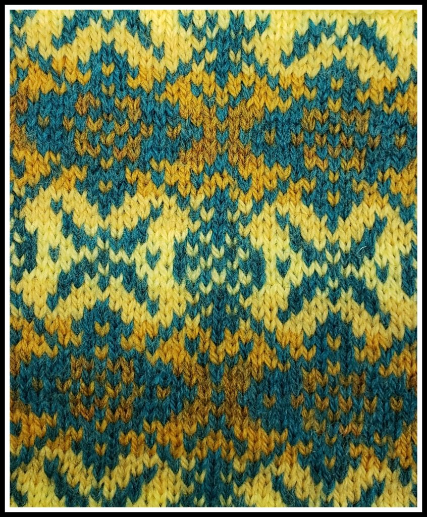
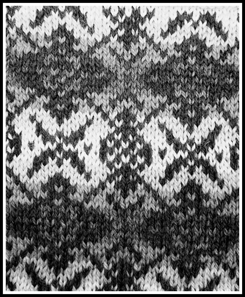
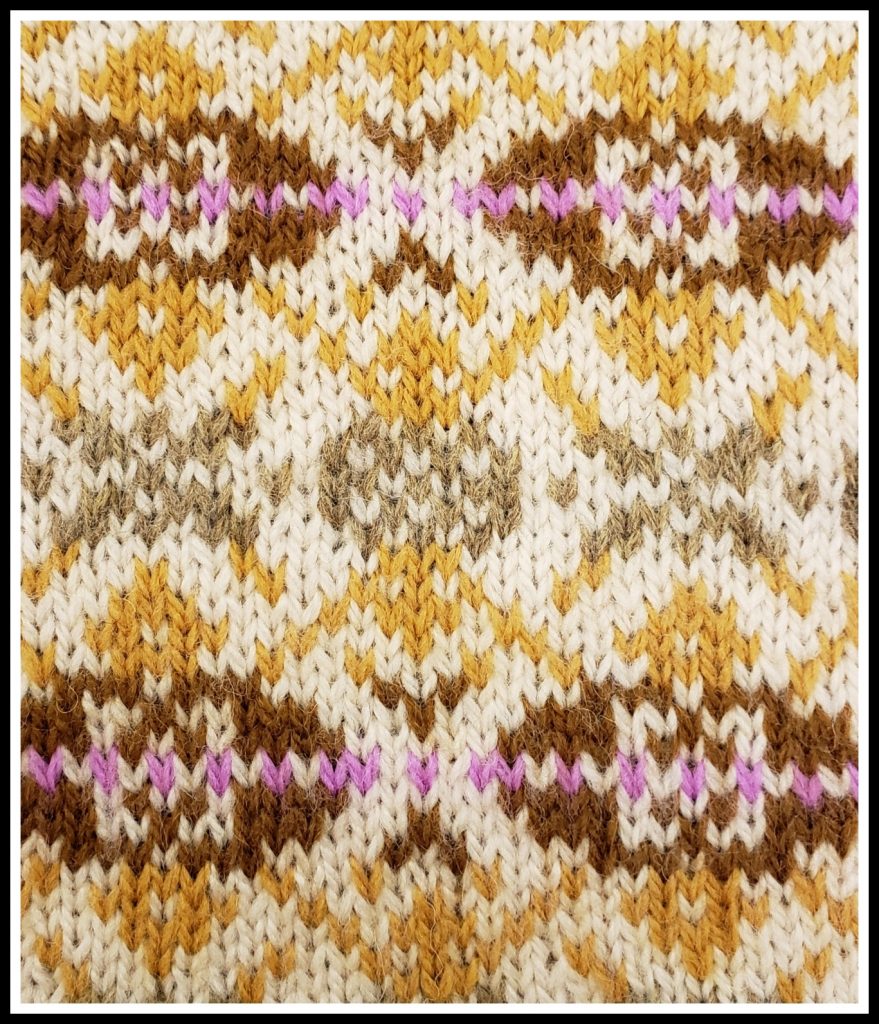
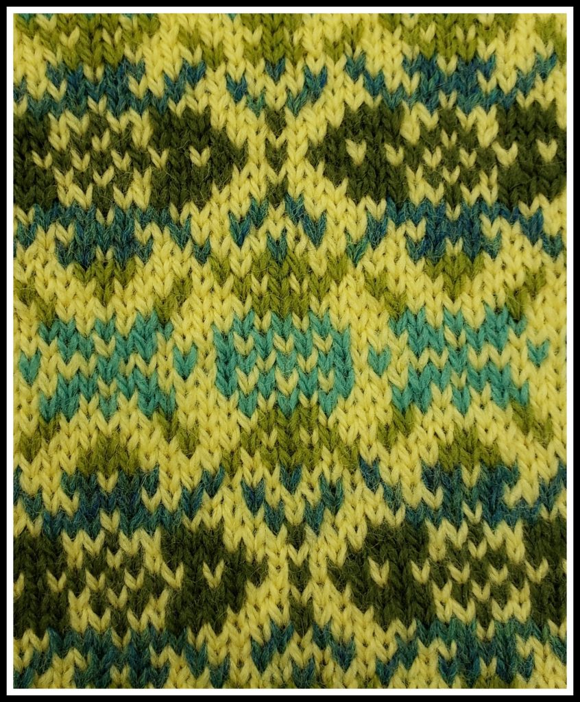
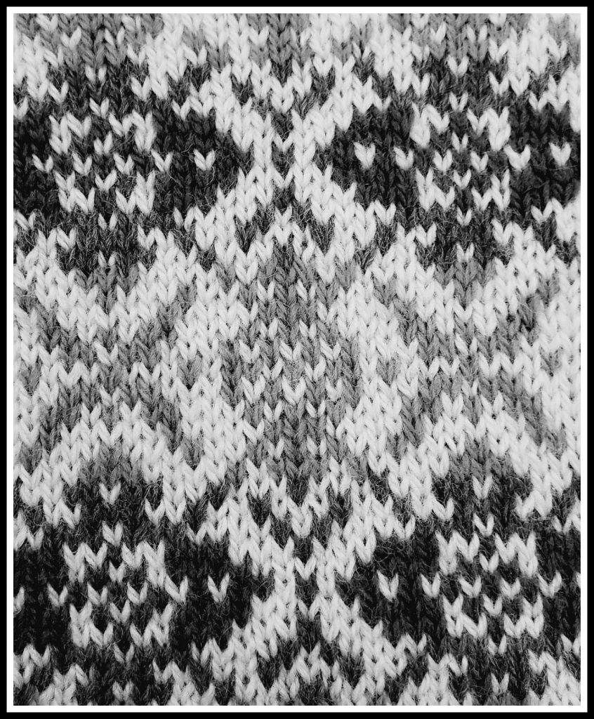
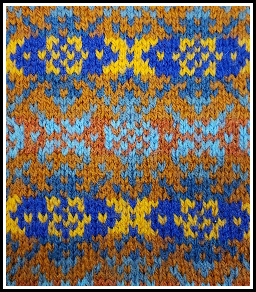
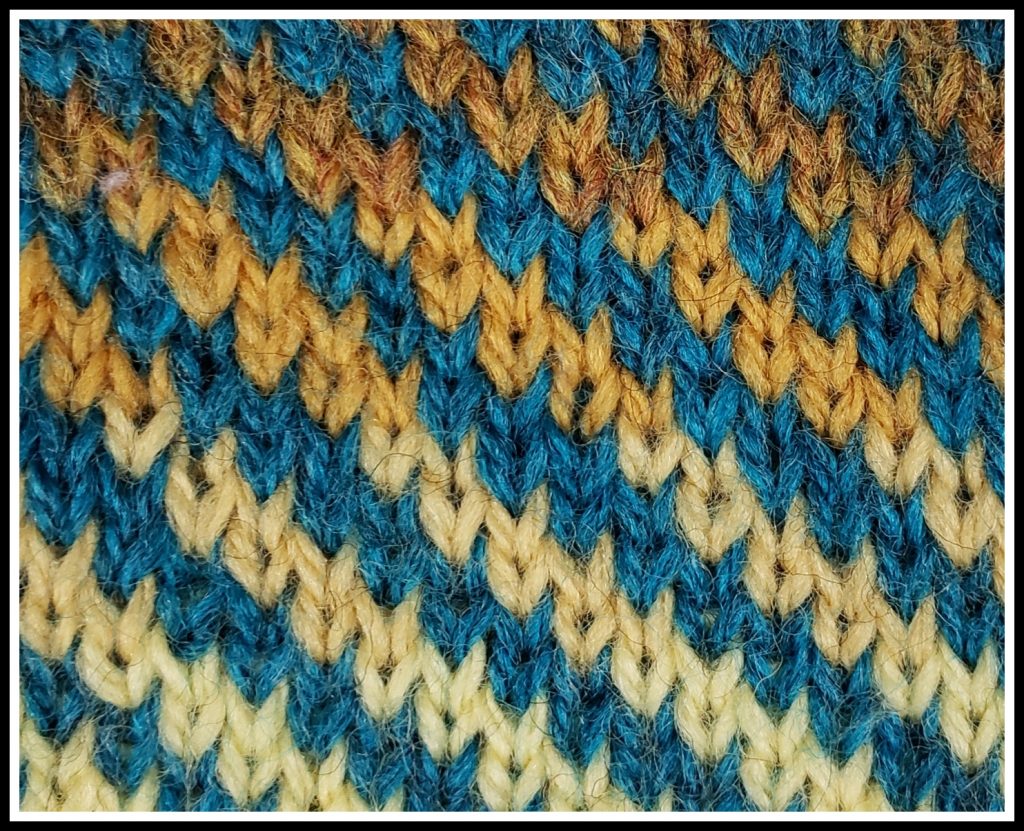
In Example 3 (below), both the background and motif colors vary from light to dark. In this type of color scheme, it is often the mid-range values that may not have enough contrast. The darkest background is adjacent to the lightest motif color, and the lightest background is adjacent to the darkest motif color. There is adequate contrast in both cases. The grayscale photo of Example 3 shows that there isn’t a lot of value difference where the mid-range background and motif colors are next to each other. However, this swatch is worked in blue and orange, which are complementary colors. As noted above, colors are enhanced when placed next to their complements. The blue seems bluer, and the orange appears more orange, making the design more obvious than it would otherwise be.
Auditioning Your Color Choices
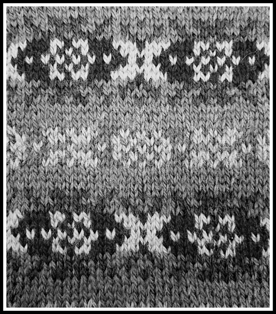
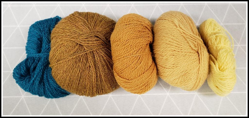
The best way to see how a color palette will work with a chosen motif is to swatch, but it can be very time-consuming to work multiple swatches using different color schemes. However, there are a few preliminary steps to help evaluate a chosen color scheme. Taking a grayscale photo of the proposed colors is the first step. Below are color and grayscale photos of the yarns used in Example 2 above. The arrangement of the background colors from light to dark is a straightforward exercise since there is enough difference in the values of those colors. Yet it isn’t immediately apparent whether there is enough contrast between the darkest background color (brown) and the motif color (teal), especially since the brown is heathered. The grayscale photo shows that there is plenty of contrast between those two colors.
In The Joy of Color: Fair Isle Knitting Your Way, Janine Bajus suggests working a “speed swatch” to test the color palette. The objective of the speed swatch is to audition the color scheme alone, not at the same time as the proposed motif design. The swatch is quicker to work, but shows the interplay of the various colors. All of the background and motif colors are worked in a simple pattern, in the planned sequence, with just a few rows of each color worked. The swatch will show how all the various colors work together. One can see if there is a color that does not fit or if something is missing. This is an especially useful technique when many different colors and values are being considered for a colorwork project. The photo below shows a speed swatch of the colors used in Example 2.
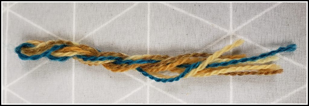
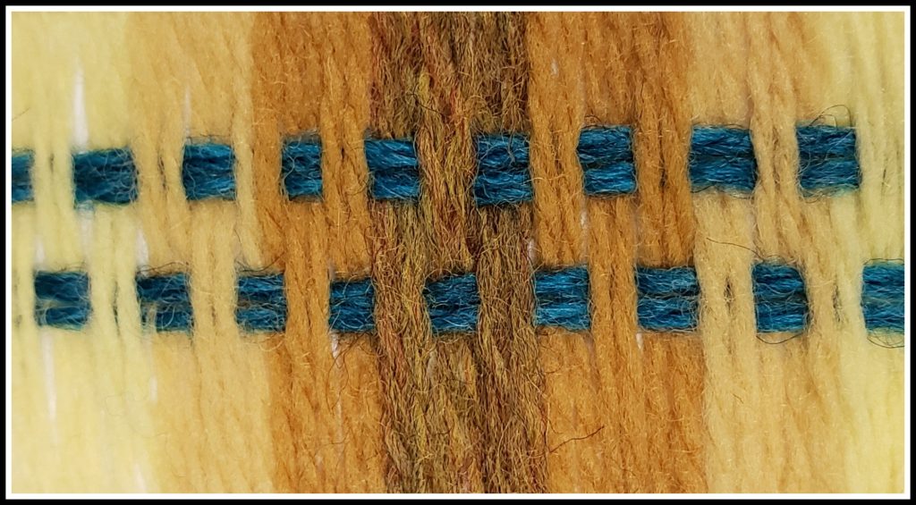
Margaret Radcliffe, in The Essential Guide to Color Knitting Techniques, gives two other suggestions for auditioning colors for Fair Isle. The first is to twist together strands of the desired yarns to see how they work together. It is easy to add or subtract strands to see the effect. The second is to wrap a card with the background colors, in the order they are planned to appear. Motif or accent colors can be woven through the wraps to see whether the palette is pleasing. Keeping the colors in the approximate proportions to the planned design gives the best idea of the result. These two techniques are shown below, using the yarns for Example 2.
Other Considerations
Use of Neutrals
Up to this point, only colors have been discussed. But traditional Fair Isle designs make use of neutrals to great effect. It is easier to distinguish relative value in natural shades. Note that stark black and bright white are usually avoided in favor of dark brown and natural white in traditional designs.
Inspiration
There are eye-catching and pleasing color palettes all around us. A favorite painting, photograph, landscape, or piece of fabric can be the basis for a Fair Isle color scheme. Observe the world around you. Notice color combinations and pleasing color palettes.
Color Confidence
As mentioned above, using multiple colors in knitting projects can be intimidating, but you can increase your color confidence by playing with color. Play with paints and mix new colors. Use the color wheel and color harmonies to try out different color schemes. Experiment with color pencils and one of the fabulous adult coloring books that are available. There are dictionaries of colors, color combinations, and color palettes. These resources are useful in broadening the definition of what colors “go together.”
Grayscale Images
There are a number of ways to obtain a grayscale image. Depending on the equipment and technology used to take the photos, the photo may be taken as a grayscale image, or may require editing a color photo after it is taken. Investigate the equipment and software available to determine the best way to take a grayscale photo.
Conclusion
Adding color can be one of the more exciting aspects of knitting beautiful projects. Understanding basic color theory, concepts, and techniques can help anyone develop the confidence to create unique and attractive Fair Isle items.
Bibliography
Abbott, Chris. “Color Selection for Fair Isle Inspired Knits.” Cast On, Spring 2017.
Bajus, Janine. The Joy of Color: Fair Isle Knitting Your Way. Willa Jane Press, 2016.
Feitelson, Ann. The Art of Fair Isle Knitting. Interweave Press, 1996.
Forte, Mary. “Fair Isle: A Quick History.” Cast On, Feb–Apr. 2009, pp. 10–11.
Leapman, Melissa. Mastering Color Knitting. Potter Craft, 2010.
McGregor, Sheila. Traditional Fair Isle Knitting. Dover Publications, 2003.
Morton, J.L. “Basic Color Theory.” Color Matters.
Radcliffe, Margaret. The Essential Guide to Color Knitting Techniques. Storey Publishing, 2015.
Sargsyan, Gayane. “Color Theory for Beginners: Itten’s Color Wheel.”
The Smithsonian Libraries. “The Science of Color.”
Starmore, Alice. Book of Fair Isle Knitting. Dover Publications, 2009.
Copyright 2023, The Knitting Guild Association, Cast On Summer 2023, All Rights Reserved
0 Comment